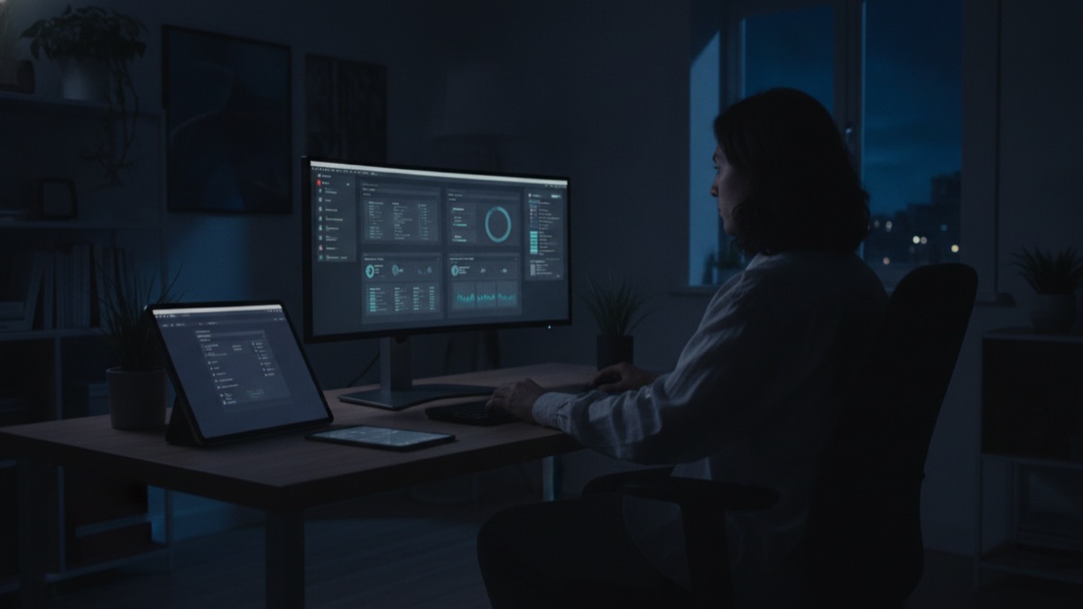
Almost every operating system, app, and major website now offers a dark theme, yet the two most commonly cited reasons for using one, saving battery and reducing eye strain, are each true only under specific conditions that most users never actually check. Dark mode's rise from a niche developer preference to a near-universal design default is a genuinely interesting mix of real engineering benefit, contested science, and plain aesthetic fashion, and untangling which part is which changes how you should actually think about the toggle sitting in your settings menu.
The battery claim is real, but only on one specific display technology; the eye-strain claim is far more contested among vision researchers than dark mode's popularity would suggest; and a meaningful share of dark mode's actual spread across the industry has comparatively little to do with either argument and a lot more to do with design trends, branding decisions, and a genuine historical inheritance from computing's earliest visual conventions.
Understanding the actual mechanics behind each of these claims, rather than just repeating the popular shorthand version of them, explains both why dark mode became standard and why, despite that, a meaningful number of apps and websites still default to light mode by deliberate design choice rather than oversight.
It also explains why the feature exists as a genuine system-level standard today, built directly into how operating systems and browsers communicate a user's preference to every app installed on a device, rather than remaining a scattered, inconsistently implemented toggle buried in individual app settings menus.
How Dark-on-Light Actually Became the Original Computing Default
Contrary to popular assumption, dark backgrounds were not a later addition to computing; they were the original visual convention on many of the earliest interactive computer terminals, largely because of the specific display hardware available at the time rather than any deliberate design philosophy about readability.
Early cathode ray tube terminals commonly displayed glowing green or amber text on a black background, a convention that emerged directly from how phosphor-based CRT displays actually worked: it was technically simpler and more power-efficient to illuminate only the specific pixels forming text characters rather than lighting an entire bright background and rendering dark text on top of it.
The shift toward light-background, dark-text interfaces came later, driven substantially by the rise of graphical user interfaces designed to visually mimic printed paper documents, a design philosophy where a white background with black text felt intuitively familiar to users accustomed to reading printed pages rather than glowing screens.
Why Terminal Screens Started Out Dark, Not Light
Beyond the phosphor efficiency argument, early monochrome CRT monitors also suffered from a specific technical limitation called phosphor burn-in, where displaying the same static bright image for extended periods could permanently etch a ghost image into the screen, making dark backgrounds with sparse bright text a more durable practical choice for hardware that stayed powered on for long stretches.
Command-line interfaces, the dominant way people actually interacted with computers for decades before graphical interfaces became standard, naturally suited this dark, high-contrast, low-detail display style, since a command prompt only needed to render sparse lines of monospaced text rather than dense blocks of continuous reading content.
As computing shifted toward word processing, document editing, and eventually full graphical desktop environments, designers deliberately moved toward the light-background convention specifically to mimic the paper documents those programs were meant to replace, a shift that had far more to do with user familiarity than with any newly discovered readability advantage.
How the Battery-Saving Argument Actually Works on OLED Screens
OLED and AMOLED displays, now standard on most modern flagship smartphones, work fundamentally differently from older display technologies: each individual pixel emits its own light and can be switched off completely, meaning a pixel displaying pure black actually draws close to zero power rather than simply being covered by a dark filter over a backlight.
Because of this per-pixel illumination, an interface using large expanses of true black can measurably reduce power draw compared to the same interface rendered with a bright white background, with independent testing by outlets like Android Authority and various academic display-research groups showing real, sometimes substantial, battery savings under dark themes on OLED hardware specifically.
The actual magnitude of the savings depends heavily on screen brightness settings and how much true black versus other colors an interface actually displays; a dark theme using dark grey rather than pure black, or a screen set to very high brightness, saves meaningfully less power than the idealized case commonly cited in dark-mode marketing claims.
Why That Same Argument Falls Apart on LCD Screens
Liquid crystal display, or LCD, screens work on a fundamentally different principle: a constant backlight shines continuously behind the entire panel, and individual pixels use liquid crystals to selectively block or allow that backlight through, meaning even a pixel displaying pure black is still being illuminated from behind by the same backlight powering every other pixel on the screen.
Because the backlight in an LCD panel draws essentially the same amount of power regardless of what color is being displayed on screen, switching an LCD device to dark mode produces negligible to zero measurable battery savings, a fact that directly contradicts the popular blanket claim that dark mode universally extends battery life across all devices.
This distinction matters enormously in practice, since most laptop screens, many budget smartphones, and the overwhelming majority of desktop monitors still use LCD technology rather than OLED, meaning the battery-saving argument that legitimately applies to a flagship OLED phone simply does not transfer to a large share of the devices people actually use dark mode on daily.
What Vision Science Actually Says About Eye Strain
The claim that dark mode universally reduces eye strain is considerably more contested among vision researchers than its widespread popularity suggests, with several peer-reviewed studies finding no consistent, statistically significant difference in measured eye strain or reading fatigue between light and dark interface themes under normal ambient lighting conditions.
Some research has actually found the opposite effect for specific reading tasks, with certain studies reporting that participants read slightly slower and with more errors on dark backgrounds compared to traditional dark-text-on-light-background layouts, particularly for longer, sustained reading of dense text rather than brief glances at an interface.
Where dark mode does show a genuine, well-supported benefit is specifically in low-light or nighttime viewing conditions, since a bright white screen in an otherwise dark room creates a much larger difference between screen brightness and ambient light, a contrast disparity that vision researchers broadly agree contributes to genuine visual discomfort regardless of which specific theme colors are involved.
How the Halation Effect Can Make Dark Mode Harder to Read
Halation is an optical phenomenon where bright text on a dark background appears to bleed, blur, or glow slightly at its edges, an effect caused partly by how the human eye's lens scatters light and partly by how many screens render high-contrast edges, and it becomes considerably more pronounced specifically for people with astigmatism.
This bleeding effect can make individual letterforms genuinely harder to distinguish from one another in dark mode, particularly at smaller font sizes or in dense blocks of text, which helps explain the counterintuitive research finding that reading speed can measurably decrease for some readers under dark themes despite dark mode's popular reputation as the more comfortable, eye-friendly option.
Because halation specifically affects light text on dark backgrounds and not the reverse, it represents one of the more concrete, measurable pieces of evidence that dark mode's readability benefits are genuinely conditional rather than universal, varying meaningfully based on an individual reader's specific eye anatomy rather than applying uniformly across all users.
Why Astigmatism Changes the Calculation for Some Readers
Astigmatism, an extremely common vision condition affecting roughly a third of adults to some measurable degree, causes light entering the eye to focus imperfectly due to an irregularly shaped cornea or lens, an effect that specifically amplifies the halation and light-bleeding problems that bright text on a dark background is already prone to producing.
For someone with meaningful uncorrected or under-corrected astigmatism, dark mode's bright-text-on-dark-background layout can genuinely feel less comfortable and less legible than a traditional light theme, directly contradicting the popular assumption that dark mode is a universal accessibility improvement rather than a preference that helps some users and measurably hinders others.
This is precisely why serious accessibility guidance from organizations like the W3C generally recommends offering both theme options rather than defaulting exclusively to dark mode as an assumed universal accessibility win, since a genuinely accessible interface accounts for the reality that different vision conditions respond differently to the exact same color scheme.
How Contrast Ratios Actually Determine Real Accessibility
Web Content Accessibility Guidelines define specific minimum contrast ratios between text and its background required for content to be considered genuinely accessible to users with low vision, and critically, these requirements apply identically to both light and dark themes rather than treating dark mode as automatically more accessible by default.
A poorly designed dark theme using, for example, dark grey text on a slightly-less-dark grey background can actually fail accessibility contrast requirements just as easily as a poorly designed light theme, meaning the mere presence of a dark mode toggle says essentially nothing about whether a specific interface is actually accessible without independently checking its measured contrast values.
Genuinely well-designed dark themes deliberately avoid using pure black backgrounds paired with pure white text specifically because that maximum-contrast combination can itself feel harsh and can worsen halation effects for many users, which is why most professionally designed dark interfaces instead use dark grey or navy backgrounds paired with slightly off-white text rather than the highest theoretically possible contrast ratio.
Why Apple and Google Actually Pushed Dark Mode Mainstream
Apple introduced system-wide dark mode to iOS and macOS in 2018 and 2019 respectively, and Google followed shortly after with Android, moves that transformed dark mode from a scattered, individually implemented feature found in a handful of specific apps into a coordinated, operating-system-level standard that every properly built app could automatically inherit and respect.
This platform-level push mattered enormously for adoption because it shifted the underlying technical burden: rather than every individual app developer needing to independently build, test, and maintain their own separate dark theme from scratch, operating systems began providing shared design tokens, system colors, and APIs that automatically adapted an app's existing interface to match the user's selected system-wide preference.
Once dark mode became an expected, standard operating-system feature rather than a niche developer add-on, it also became a meaningful competitive and marketing differentiator, with both companies actively promoting dark mode in major product launch presentations as both an aesthetic upgrade and, drawing on the genuine OLED battery benefit, a practical one for their premium device lineups.
How CSS prefers-color-scheme Actually Made System-Wide Theming Possible
The CSS media feature prefers-color-scheme, which became a formal, widely supported web standard around 2019, allows a website's own stylesheet to automatically detect whether a visitor's operating system is currently set to light or dark mode and adjust the site's colors accordingly without requiring any manual toggle on the website itself.
Before this standard existed, a website that wanted to offer a dark theme had to build and maintain its own separate toggle, store that preference somewhere like a cookie or local storage, and had no reliable way of automatically respecting a visitor's system-level preference the very first time they landed on the page.
This technical standardization is precisely why dark mode support today feels so consistent and expected across the web rather than a scattered patchwork of custom-built toggles, since a single, well-supported CSS media query now lets developers implement genuinely responsive theming with a fraction of the custom code previously required.
Why Design and Branding Reasons Matter as Much as Technical Ones
Beyond battery life and eye strain, dark mode carries genuine aesthetic and brand-positioning value that has meaningfully driven its adoption independent of either technical argument, since dark interfaces are widely perceived within design culture as sleek, modern, premium, and technically sophisticated, an association many products and brands actively want to project.
This perception has been particularly pronounced in gaming, creative software, and premium consumer electronics marketing, where dark interfaces let vivid colors, sharp imagery, and video content visually pop against a neutral dark background in a way that a bright white background can sometimes wash out or visually compete with.
Design trends genuinely do cycle, and dark mode's current widespread popularity reflects, in meaningful part, a broader contemporary design aesthetic favoring darker, moodier, more minimal visual palettes across not just software but architecture, product design, and marketing more broadly, a stylistic wave that would likely have driven dark mode adoption to some degree even without any battery or accessibility argument at all.
How Individual Apps Actually Implement Per-App Theming
Most modern apps implement dark mode support by defining a set of semantic design tokens, abstract names like "background," "primary text," and "border," that map to different actual color values depending on which theme is currently active, rather than hardcoding specific colors directly throughout an app's individual screens and components.
This token-based approach lets a well-built app switch themes instantly and consistently across every screen simultaneously, since changing the underlying color values assigned to each semantic token automatically updates every single interface element referencing that token, rather than requiring a developer to manually update colors screen by individual screen.
Apps that were originally built without this systematic token structure in mind, particularly older, established codebases, often face considerably more difficulty retrofitting genuine dark mode support later, frequently requiring extensive rework rather than a comparatively simple toggle, which partly explains why some older, more established apps were notably slower to adopt dark theming than newer competitors.
Why Some Apps Still Default to Light Mode Anyway
Certain categories of apps deliberately continue defaulting to light mode despite dark mode's broad popularity, particularly productivity and document-editing tools where users are actively producing content, like text documents or spreadsheets, that will ultimately be printed, shared, or viewed by other people primarily on a white background.
Photo and video editing applications also frequently default to dark or neutral grey interfaces rather than pure light or pure dark themes specifically because bright white surrounding an image can visually distort a creator's perception of the actual colors and contrast within the photo or video content they are actively editing and trying to judge accurately.
Some products deliberately retain a light-mode default purely for brand consistency reasons independent of any functional argument, since a company's established visual identity, logo colors, and marketing materials may have been built specifically around a light, bright aesthetic that a dark interface would genuinely clash with or meaningfully undermine.
Sources
- Wikipedia — overview of dark mode, its history, and adoption across major platforms
- W3C Web Accessibility Initiative — official guidance on contrast ratios and accessible color scheme design
- MDN Web Docs — technical documentation on the prefers-color-scheme CSS media feature
- Electronic Frontier Foundation — research context on display technology and user interface design trends
FAQ
Does dark mode actually save battery life?
Yes, but only on OLED and AMOLED screens where black pixels draw near-zero power; on LCD screens, which use a constant backlight, dark mode produces negligible battery savings.
Does dark mode reduce eye strain?
The evidence is mixed; dark mode helps mainly in low-light conditions by reducing screen-to-ambient brightness contrast, but several studies found no consistent eye-strain benefit in normal lighting, and some found reading was slightly slower on dark backgrounds.
Why can dark mode be harder to read for some people?
An optical effect called halation makes bright text on dark backgrounds appear to bleed or blur at the edges, an effect that is significantly more pronounced for people with astigmatism, a very common vision condition.
Why did dark mode start on early computers in the first place?
Early CRT terminals displayed bright text on black backgrounds mainly because it was more power-efficient for phosphor displays and reduced screen burn-in, not because of any deliberate readability research.
How does a website automatically match my system's dark mode setting?
The CSS prefers-color-scheme media feature, standardized around 2019, lets a website detect your operating system's light or dark setting and adjust its colors automatically without a manual toggle.
Why do some apps still default to light mode?
Apps focused on documents meant to be printed or shared, photo and video editors where a bright surround can distort color perception, and products with an established light-brand identity often keep light mode as the default.
About the Author
We reference Wikipedia and other authoritative sources to explain the background and current understanding of this topic.
Loved This Article?
Share it on WhatsApp → Share it on WhatsApp
Get more guides in your inbox — Subscribe to our newsletter for weekly surprising stories from Egypt, Saudi Arabia, Dubai, and beyond.